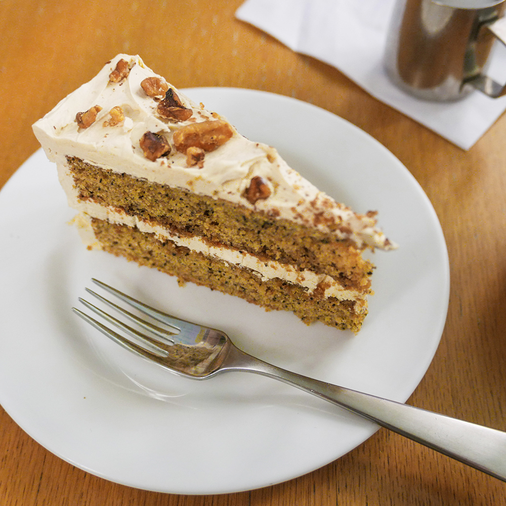
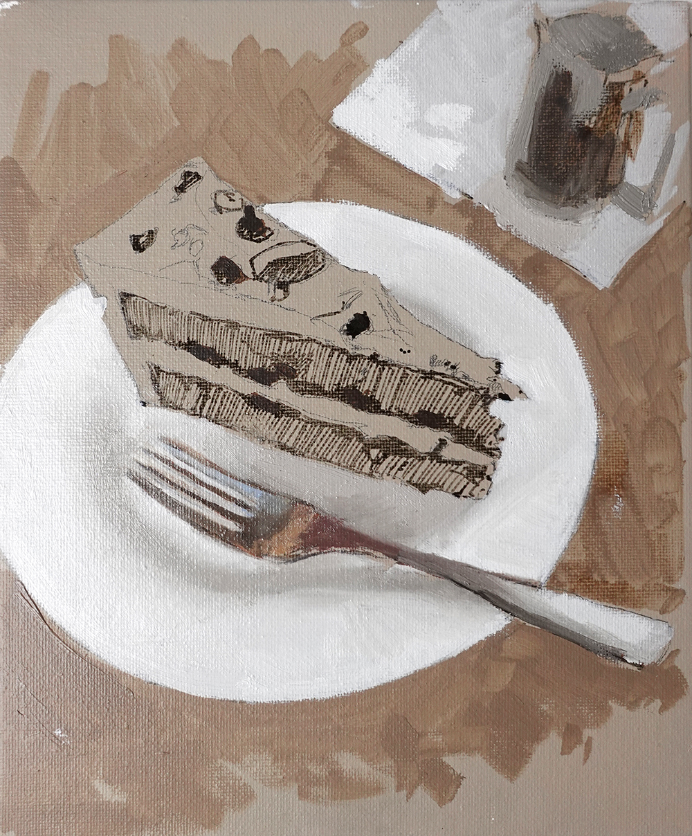
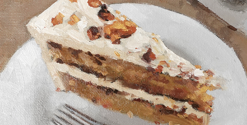
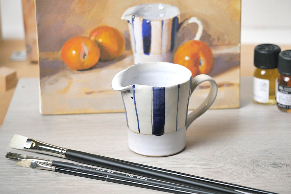
This epic coffee and walnut cake is from Tate Britain café I sampled after the Singer Sargent Exhibition. Painted with the equally buttery cobra oil paint water-mixable oil paint, but the techniques would equally apply to painting with acrylics or traditional oils.
I hope it brings as much warmth to your day as the cake brought to mine!
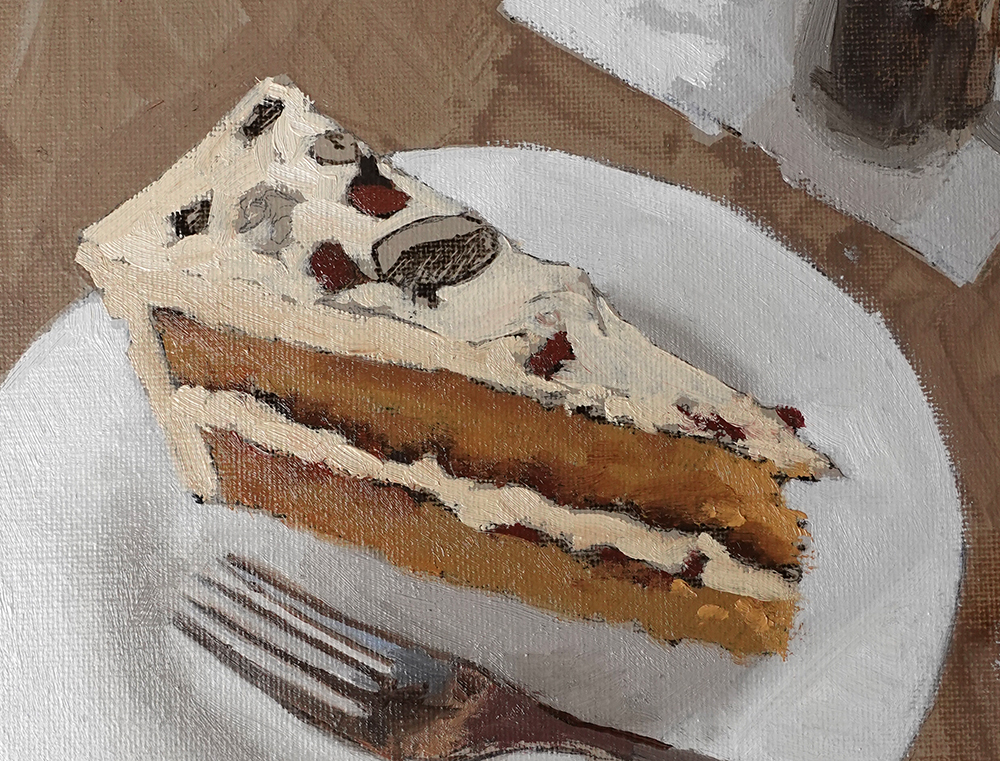
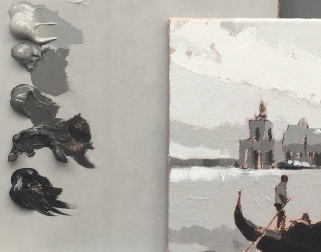
Reference Image for the painting
Materials you will need:
Surface: 10 x 8 inch (20 x 25cm) canvas board
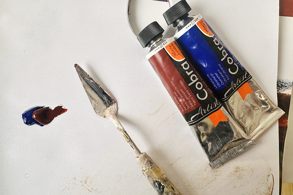
Paint Colours
For the foundational layer, known as the initial block-in, I used acrylics due to their fast-drying nature.
Burnt Umber (Golden Acrylic Paints)
Titanium White (Golden Acrylic Paints)
Neutral Gray 8 (Golden Acrylic Paints)
Following the acrylic base, the rest of the painting was created using water-mixable oils.
For the coloured ground, I’m using a mix of Burnt Umber & Titanium White diluted with water.
The wooden tabletop felt quite warm, a little too orange, so I wanted to mute that intensity down to concentrate on the cake so it stood out more.
It was diluted with water and applied thinly to allow the subsequent oil layers to grab on. You could also paint this layer with WMOs if you prefer.
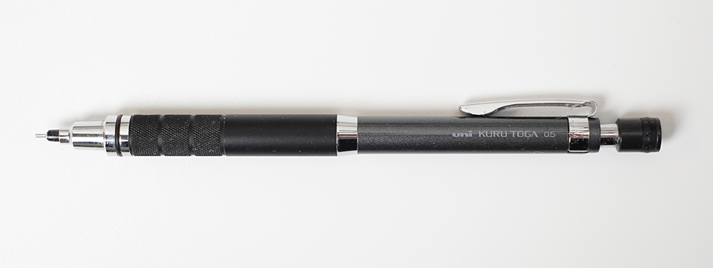
I’m drawing with a 0.5mm mechanical pencil, HB
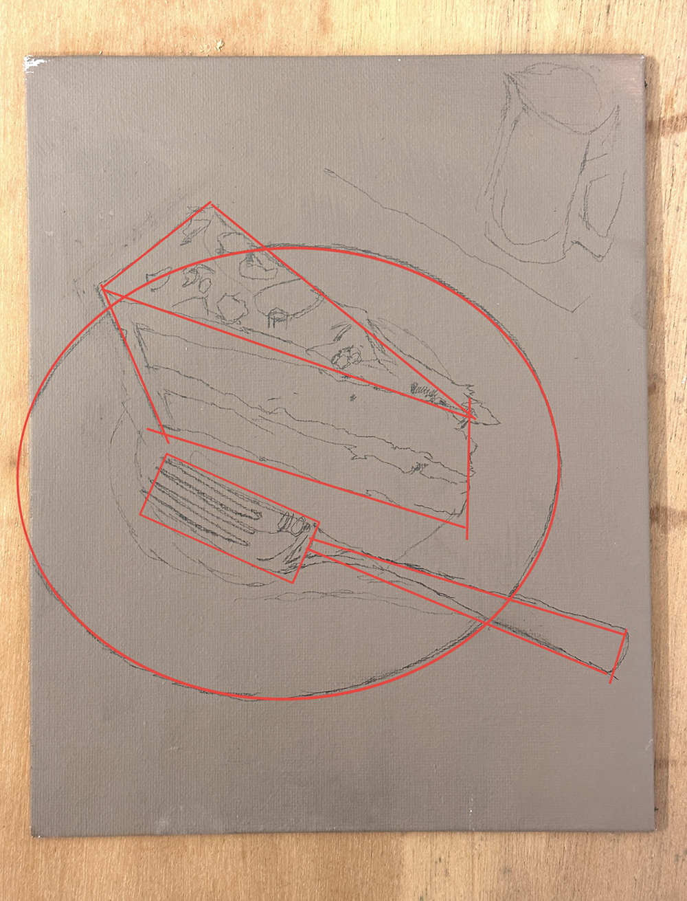
There is a simple triangular and circular shape to the composition, and I sketch out quite loosely. As long as your drawing is within those basic shapes it will read as a cake on a plate.
The reference image was in a square format but I felt the plate could do with a bit more breathing space. I also shortened the fork to include the end of a handle and added a top to the milk jug.
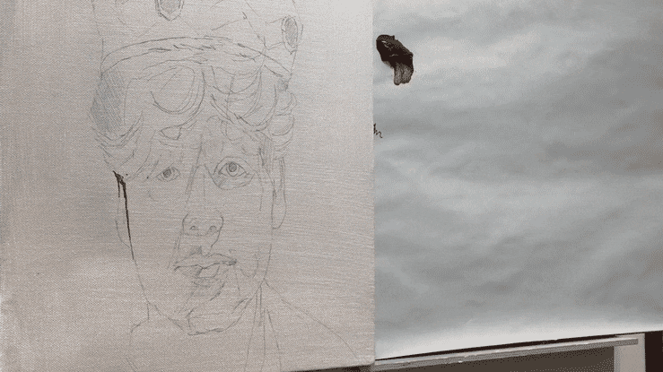
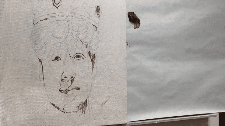
Step #2: Draw in the darkest value with a paint marker
Once the pencil drawing has been corrected here and there with a light erase, I draw over the top, just looking at the key dark areas, with an F & W Daler Rowney mixed-media paint marker.
The marker allows me to see the shadow shapes more clearly and get an idea of how the dark accents can be used to move the eye through the painting. The marker is filled with a fluid acrylic paint in Sepia.
The milk jug at the top was starting to take my eye, so at this stage, I decided to keep that quite sketchy and focus on making the cake more realistic.
I’m using Neutral 8 Grey from Golden Paints and a little Titanium White, diluted with water and then washed onto the plate. I’m not looking for any variation in application or tonal range. I’m not trying to get anything perfect; I just want a closer value to the reference image.
Step #4: Mix a Black with Water-Mixable Oils
Use 2/3 Ultramarine Blue to 1/3 Burnt Sienna and mix a Black using the palette knife.
Pro tip: You can check how neutral your mix is by adding a speck of white. Then add more blue or more orange to balance it out.
This mix is used as a base to mix a grey colour string for the plate and the fork.
Although the plate appears to have only a couple of colours, there are a surprising number of subtle shifts in the shadow areas on the plate and on the edge of the fork.
Colour string of greys used for painting the plate. Notice how the darker tones are warmer and I’ve cooled the lighter tones
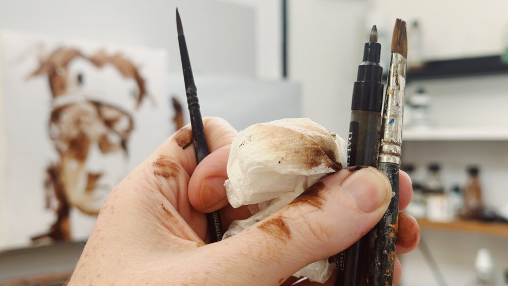
For all my mixes, I use a palette knife. Due to oils’ slow drying times, I can leave these piles of paint out on the palette for the duration of the painting. They can be used to grey down colours and adjust the saturation as I progress.
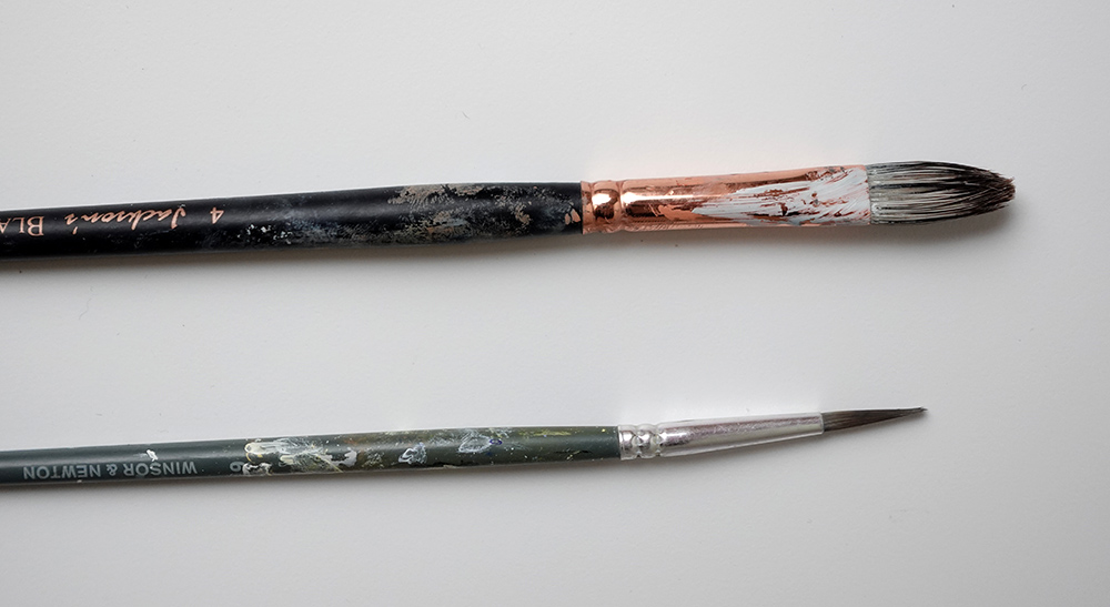
There is also a sketchy, muted brown around the plate. This was applied using the size 4 black hog. The stiff bristles respond well to faster movements with the brush.
For the entire painting, water was exclusively used as the diluting medium.
Step #5: Block in the cake
Without buttercream, the cake falls apart.
This was the stage of the painting where it felt like nothing was going to work.
The cake felt blocky, the fork looked stuck on and the plate felt too simplistic. When self-doubt creeps in, you need to just ask yourself.
Q.Have I finished blocking in all areas?
A. No.
Ok..calm. Finish blocking in all areas then check again.
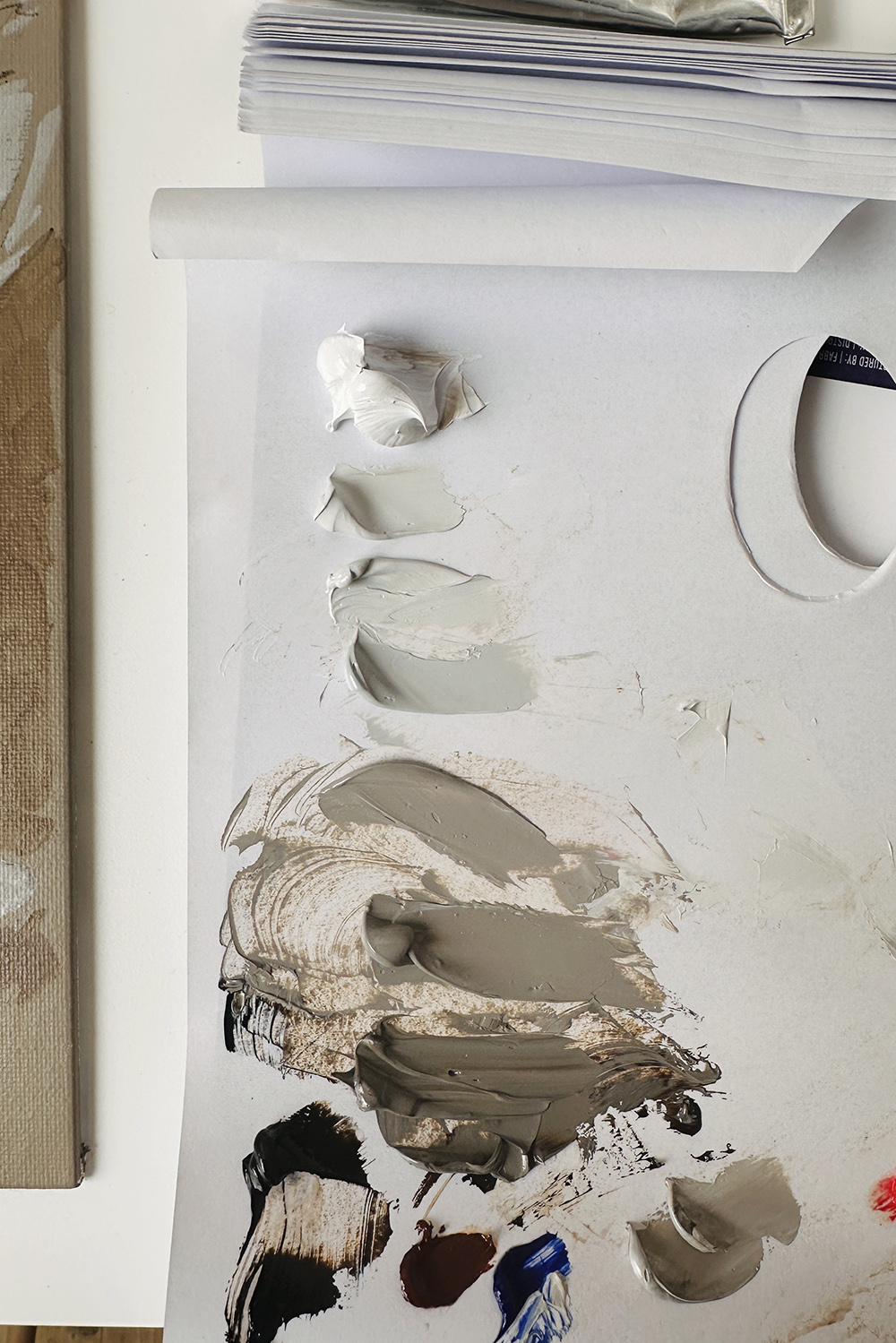
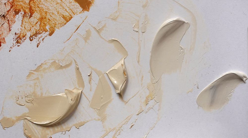
Step #6: Mix your buttercream
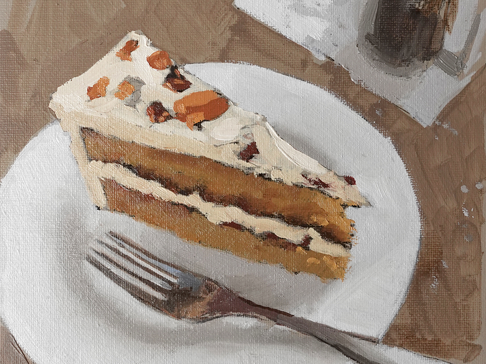
This looks like it moved on quite a bit, but interestingly, the fork is the same, the cake is the same, and the plate is the same. Just by having the lighter mixes of the buttercream, our focus is now on the top of the cake.
Colours mixed for the buttercream frosting
I mixed 3-values, so I can get a sense of light hitting the top of the cake. Once all of these areas are blocked in, it’ll be much easier to compare the values.
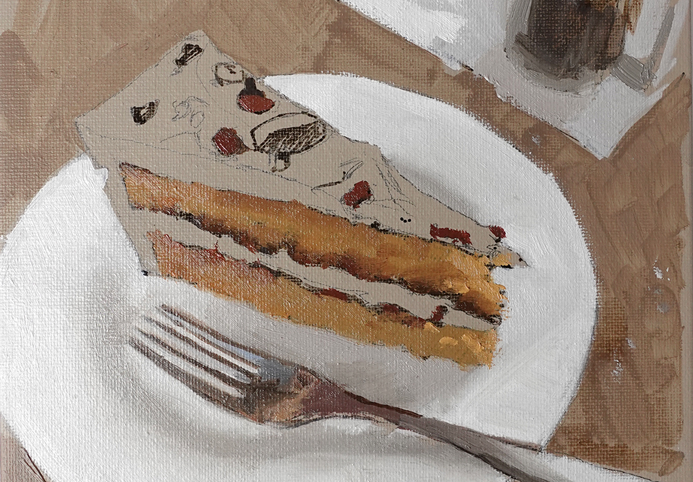
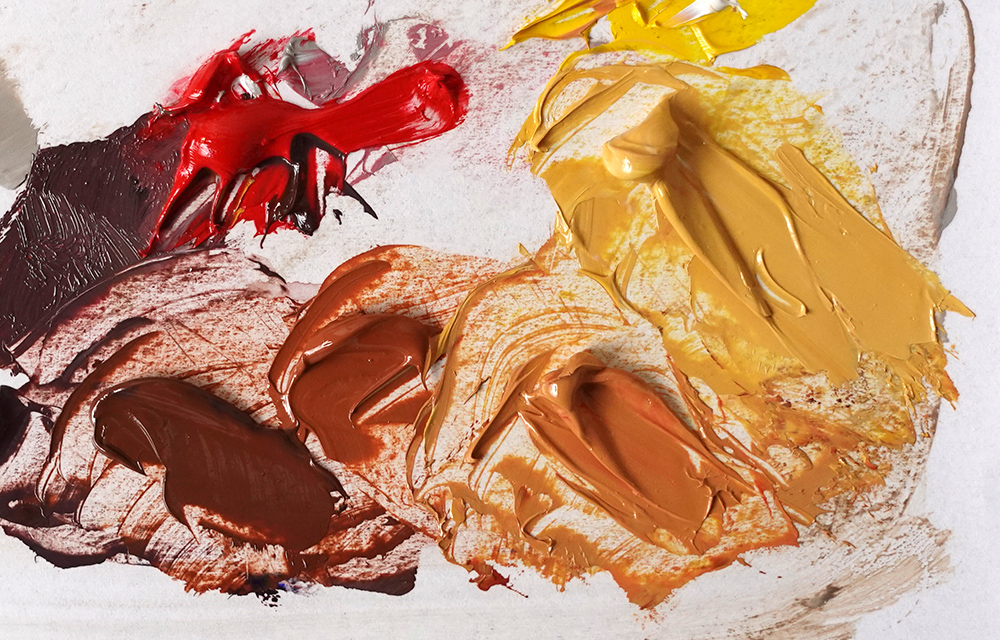
Step #7: Add a sprinkle of walnuts
I mixed a range of oranges using the Permanent Yellow Light, Pyrolle Red, Burnt Sienna and Yellow Ochre.
There are some darker values in the walnuts that almost have a purple hue, so I mix a little Ultramarine Blue in with the Pyrolle Red.
Step #8: Layer up your colours
I can now start overlaying colours onto the base mixes, breaking through some of those sharper lines to create a more impressionistic pattern of colours on the cake surface. The plate and the background remain unchanged.
I’m mostly using the filbert brush, but will occasionally swap to the round brush for fine details.
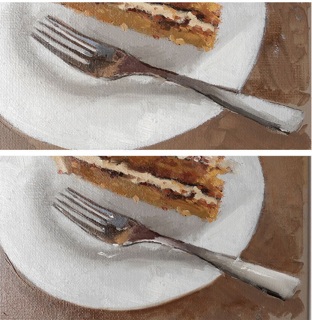
Step #9: Paint the reflections on the fork
When painting chrome surfaces, try to imagine the shape without any highlights or reflections. This allows you to concentrate on the different reflected colours that are showing in the surface.
Then the highlights can be painted on with Titanium White. I’m using the round brush for these details.
It’s always amazing how much the highlights bring the chrome to life! I’ve also added a darker cast shadow around the bottom of the plate to give it more solidity.
Step #10: Finishing touches
Coffee, Cake & Critique, Will Kemp, Oil on Canvas Board
I pushed the buttercream a bit by adding some more titanium white into the mixes. Also, a few more high saturation yellows on the front and edge of the cake.
Hope you enjoyed the lesson.
If you’re intrigued by water-mixable oils and want to delve deeper into how they stack up against acrylics, explore the most suitable mediums, accelerate drying times, master the technique of layering from ‘fat-over-lean’, and learn the art of glazing, then the Beginners Water-Mixable Oil Course might be perfect for you.
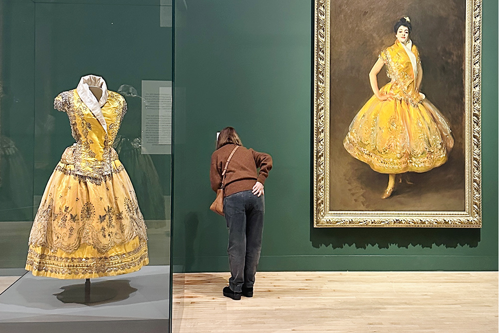
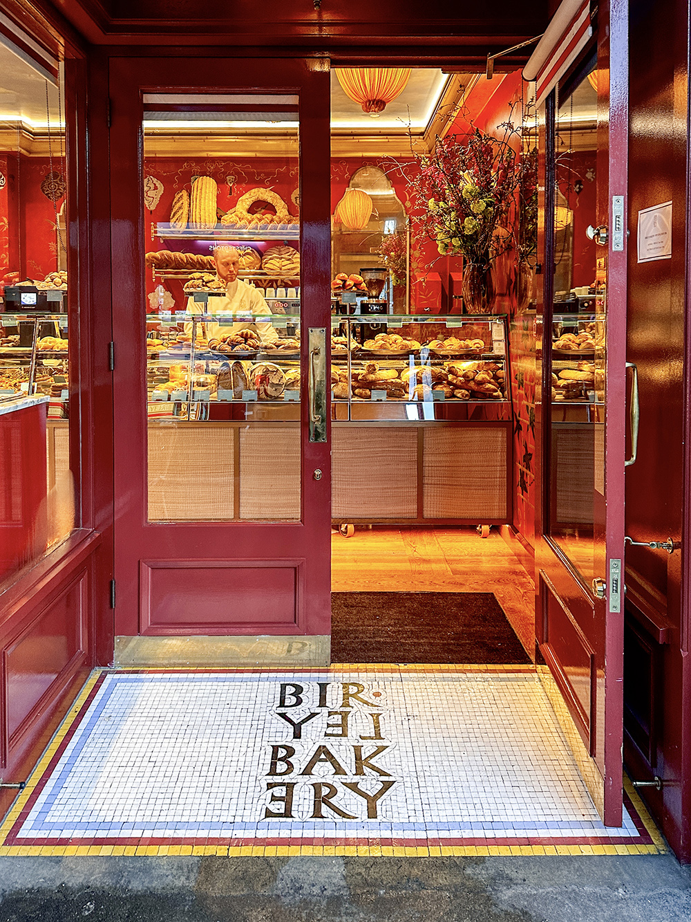
Walking through Chelsea, I kicked off the adventure at Birley Bakery with a delectable almond croissant, crispy golden-brown pastry, toasty warm out the oven and the sweet almond paste within.
Baked goods in hand, I was on the search for John Singer Sargent’s former home and studio.
Sargent (1856–1925) is known for his fabulous brushwork.
He painted portraits of society families, powerful art collectors or theatrical performers draped in satin, lace and rich velvets. He contrasted bolder, impressionist brushstrokes on the fabrics with a lightness of touch on the features.
Born in Florence in 1856 to American parents, he lived in several European countries as a child before shaping his artistic reputation in Paris. (You can see a portrait of his tutor in the article: Singer Sargent & Friends)
In 1886, Sargent settled in London at the centre of society with an accomplished circle of friends that included Henry James, Claude Monet and James Abbott McNeil Whistler.
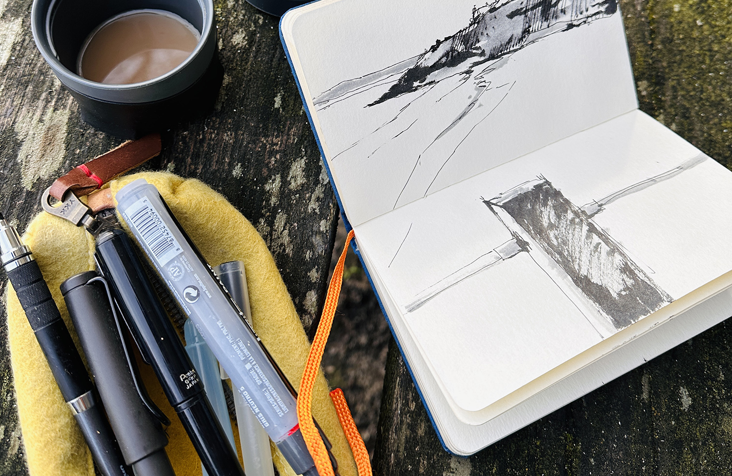
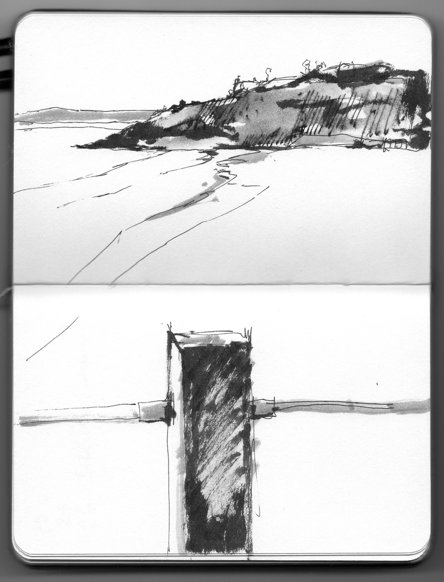
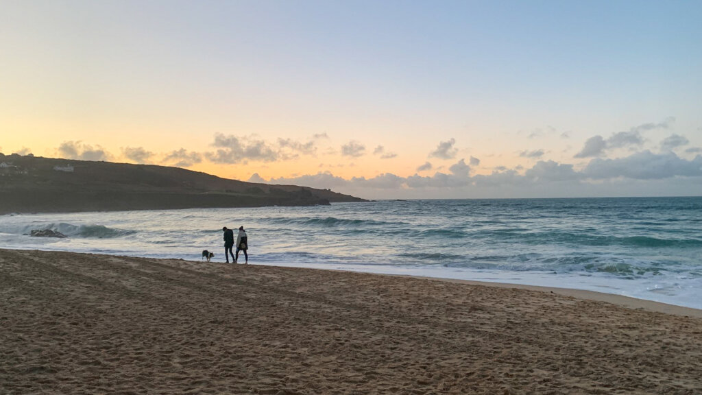
I thought I’d share with you a little seascape sketch that I did the other day.
It’s filmed in real-time, so you can actually see how long I take and how my decision process works when drawing.
You’ll see moments when I pause and reconsider what pens to start with and what pens I end up finishing with. You also see me having a cup of tea throughout the sketch because sometimes, just having a brew will give you that little bit of contemplation time to decide what to focus on next.
If you haven’t got 10 minutes to watch it all, I’ve also made a shorter 60 seconds edited version on YouTube shorts (and a 90-second one on Instagram)
Watch along in real-time as I sketch the shoreline of Porthminster beach, St Ives, Cornwall
60-second version below:
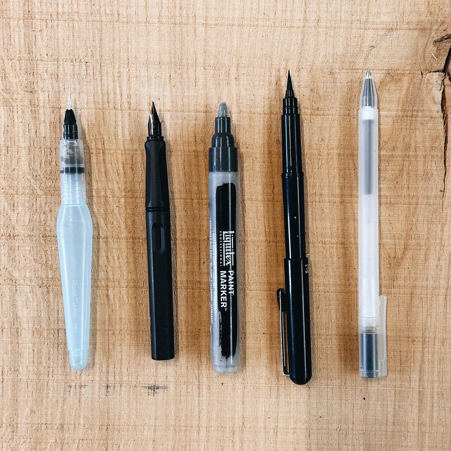
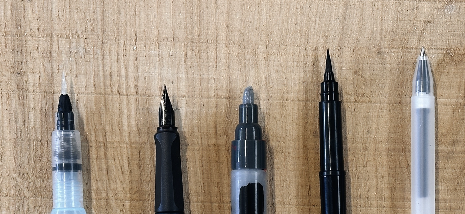
Sketching Pens, from Left to Right: Pentel Aquash Pen, Lamy Safari Fountain Pen, Liquitex paint marker, Pentel brush pen, Muji 0.5mm gel pen.
Close-up of the different sketching pen nibs
The sketching pens that I use:
MUJI 0.5mm gel tip pen
Pentel brush pen
Liquitex grey acrylic marker
Lamy Safari Fountain Pen
Pentel Aquash water pen. (This is an empty pen that’s just got water)
The real trick to this technique, and the thing that’s the most enjoyable to do, is to lay down areas of permanent ink with the first pen and then add in other areas with non-permanent ink. Then, when I wash over that area with a water brush pen, you get a beautiful soft wash effect.
The Sketchpad is by Handbook, their trav.e.logue series; it’s relatively small but perfect for backpacks, and the flask is from the Thermos Ultimate series, which is exceptionally good at keeping your tea or coffee hot. I find the 900ml version keeps the tea hotter for longer, but the smaller size is nice for shorter trips. We’re talking 24 hours hot.
Sketch Location
I’ve also added the sketch location using What3Words. If you haven’t come across what3words before, it’s an amazing free app you can use to locate any 3m x 3m square in the world. Each square across the globe has been assigned a unique combination of three words.
It can be handy if you’re showing your work in an obscure location or delivery drivers keep on missing your address, as they do quite often in Cornwall; recently, we used it when we broke down on the A30! Also great for outdoor sculpture trails or street art installations. If you’re ever visiting St Ives in the future, you can track down the exact sketch spot.
I hope you enjoy it, and if you want to learn any more about urban sketching or landscape sketching, you can follow the links to learn more about the courses.
“Making art is dangerous and revealing. Making art precipitates self-doubt, stirring deep waters that lay between what you know you should be, and what you fear you might be.”- Art & Fear
Yesterday afternoon, I found myself lost in a maze of handwritten notes about books I’d enjoyed and was excited to recommend.
Twenty minutes in, an article about Da Vinci piqued my interest, so I moved to the comfy sofa to fully concentrate. An endeavour that culminated in me falling asleep.
Ironically, I’d sat down to share the secrets of avoiding procrastination, mastering time management, boosting art sales, and living a more creative life – but I had gotten distracted.
That said, reading about Leonardo was not only fascinating but enlightening.
Architect, engineer, scientist, sculptor and painter. His first job was as a theatrical producer and set designer, teaching him tricks with perspective that he carried on through into his paintings.
The Last Supper, Leonardo Da Vinci, Tempera on Gesso, c.1495-1498
Notice the viewpoint and how the angle or perspective of the table top has been shifted very slighlty towards us to reveal more of the surface but still sits comfortably within the composition, I’d never really noticed this before.
If you wanted ideas, he was your man.
Leonardo’s interests were broad, and new subjects compelled him so intensely that he usually left projects unfinished, which meant working with him was a nightmare. Clients would avoid relying on him because he couldn’t be trusted to finish.
“to urge Leonardo the Florentine to finish the work on the Refectory of the Grazie, which he has begun, in order to attend afterwards to the other wall of the Refectory of the Grazie; and that agreements to which he has subscribed by his hand be fulfilled, which shall oblige him to finish the work within the time that shall be agreed upon with him.” From Leonardo by Martin Kemp
He spent most of his time observing nature or pondering on scientific theories. In his defence, he was just getting interested in other more captivating subjects, like how to fly or understanding human anatomy.
Really, he was just being curious, which is making me feel a lot more soothed about my limited attention span.
“In addition to his instinct for discerning patterns across disciplines, Leonardo honed two other traits that aided his scientific pursuits: an omnivorous curiosity, which bordered on the fanatical, and an acute power of observation, which was eerily intense.” – Walter Isaacson, Leonardo Da Vinci
So, after reading (or revisiting) over 20 books in 2023, here is a list of 5 books that have sparked my curiosity and given me some ideas and principles I’ve tried to adopt in my daily routines.
Live a More Creative Life
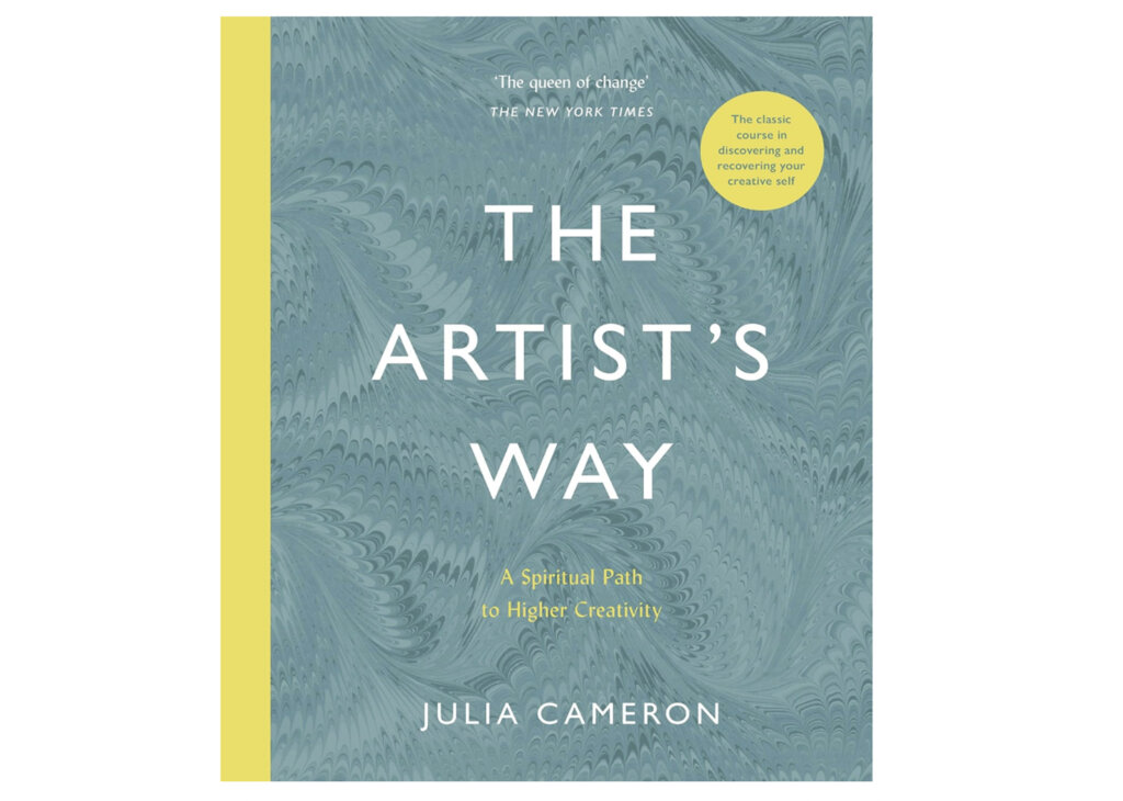
The Artist’s Way: A Spiritual Path to Higher Creativity by Julia Cameron
“But do you know how old I will be by the time I learn to really play the piano / act / paint / write a decent play?” Yes . . . the same age you will be if you don’t.”
― Julia Cameron, The Artist’s Way: A Spiritual Path to Higher Creativity
The Artist’s Way is laid out as a 12-week program to get back in touch with your creative self, with exercises, activities, and insights that help you overcome creative blocks and discover your true potential as an artist. Ever heard of ‘morning pages’? This book will show you how this simple practice can revolutionize your creativity and bring clarity to your life.
I read this book as an art student and can’t remember finishing the whole 12-week course, but I adopted two key practices that I use to this day.
Morning Pages
Artists’ Dates
Morning pages are so handy to stop your mind whirring over issues. The practice is to write freehand using a pen and paper, three pages of a train of thought. No editing, no re-reading, no punctuation. Just pure free-flowing words. If you’ve been tied to your keyboard, writing longhand for three pages can seem to take ages.
Your handwriting might not be able to keep up with the speed of your thoughts, but it can be very beneficial. Just getting any ideas, worries, or frustrations down on a page has a really therapeutic effect.
You’re not looking for solutions; you don’t re-read to try and discover your problems; you just write. The process is the cure.
I also love the concept of ‘Artist Dates’.
If you want to feel inspired, you need to book a date with yourself to go to an event, a museum, or a show. Preferably on your own (although I often bend the rules a bit and go with Vanessa)
So check your calendar for the next month. Where are you going to get inspired?
Making a date, actually going to a museum, going to a bookshop, going to these things on your own rather than with friends is the key; otherwise, you tend to end up just going for a coffee….( erm…I can confirm that is mostly true but we still had fun)
Face the fear of creating your art
2. Art & Fear: Observations on the Perils (And Rewards of Artmaking) By David Bayles and Ted Orland
“What separates artists from ex-artists is that those who challenge their fears, continue; those who don’t, quit. In large measure becoming an artist consists of learning to accept yourself, which makes your work personal, and in following your own voice, which makes your work distinctive.” – David Bayles & Ted Orland, Art & Fear
This book is particularly helpful if you went to art college but haven’t quite fulfilled that potential that you dreamed about whilst quaffing ale in the student union. It looks into the fears we all face – fear of failure, not being good enough, or not being understood. The authors, both artists themselves, share personal stories and advice on their own art journeys.
One key thing that beginners often get hung up on is their own style. If you’re searching for your style and have trouble thinking you’ll never find a unique voice. The exciting thing is that your unique voice is just by being you! Yay.
It’s a short read with motivational insights. The Artist Way is a slower-burn 12-week program; this feels like a little motivational boost when you need it.
“To all viewers but yourself, what matters is the product: the finished artwork. To you, and you alone, what matters is the process.” – David Bayles & Ted Orland, Art & Fear
Make Time for Your Art
How do you control your attention to focus on what matters in a world that’s trying to distract you from living the creative life you dream about?
These next books help you to make time, appreciate the dedication needed for deep artistic work and prevent yourself from becoming distracted from the task at hand.
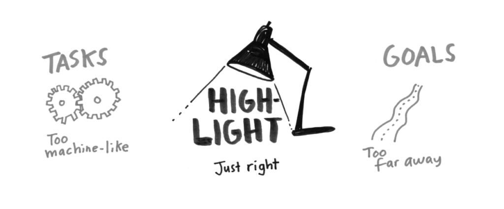
3. Make Time: How to Focus on What Matters Every Day By Jake Knapp & John Zeratsky
“What Will Be the Highlight of Your Day?
We want you to begin each day by thinking about what you hope will be the bright spot. If, at the end of the day, someone asks you, “What was the highlight of your day?” what do you want your answer to be? When you look back on your day, what activity or accomplishment or moment do you want to savor? That’s your Highlight.
Your Highlight is not the only thing you’ll do each day. After all, most of us can’t ignore our inboxes or say no to our bosses. But choosing a Highlight gives you a chance to be proactive about how you spend your time, instead of letting technology, office defaults, and other people set your agenda.” – Make Time by Jake Knapp & John Zeratsky
‘Make Time’ is helpful if you’re struggling with finding time for your art. Juggling your schedule with your passions and everything else can roll into one. The authors both used to work at Google, and they have some great frameworks on how to prioritize your day. They also talk about social media and ‘infinity pools’. Apps that can continue to show you an exorbitant amount of things to distract you from what you want to get done.
The two main methods I use from the book are:
Daily Highlight
Time Timer
Illustration from: Make Time by Jake Knapp & John Zeratsky
I’ve found the daily highlight is a great way to be able to set a focus for the day that you’re excited about, but you know you can achieve without getiing into the minutiae of the to-do list. It’s also a great way to remember what happens on a daily basis, especially if things are super busy. (Another good method for this is ‘homework for life‘ by Matthew Dicks from the book Storyworthy)
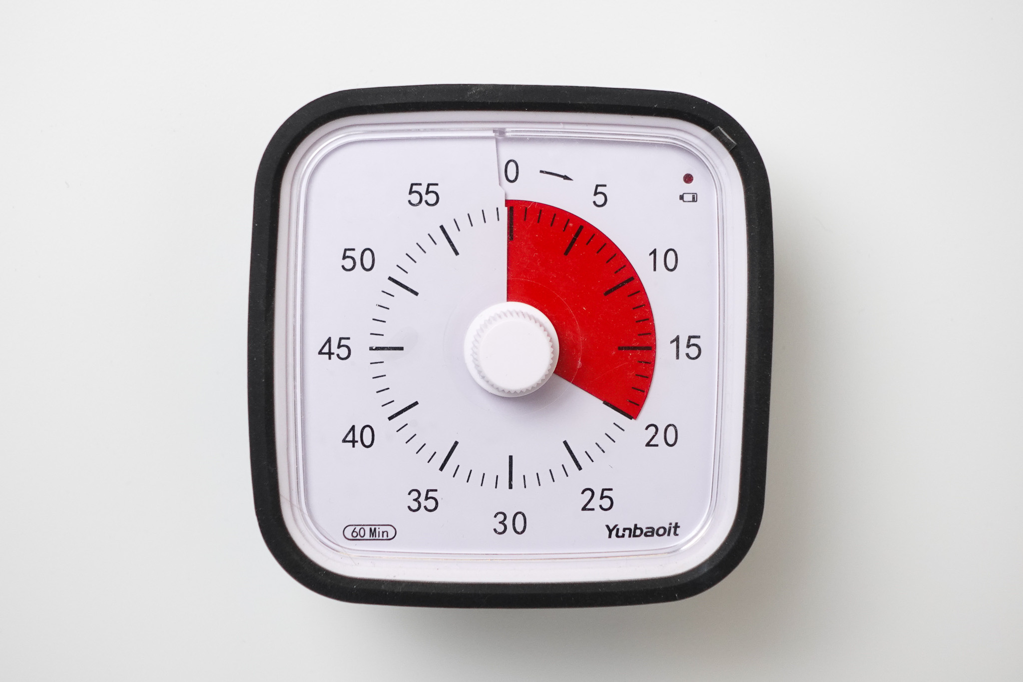
My brothers and sisters often laugh at the other method I use.
It’s a timer.
Meant for and used by kids.
And I love it!
You turn the dial, and the red wedge gets progressively smaller as the timer runs down.
I have it on my desk, and I can quickly glance at how long I’ve been working rather than checking an app on my phone and getting drawn down another path! If you want to draw for 10 minutes, set a timer. See if you can answer your emails in 20 minutes and still have time for painting in the hour; set a timer.
It’s not for everyone; Vanessa often tidied it away when it first arrived because, for her, there was no conceivable reason why anyone would need it. And apart from anything else, it was ruining the look of the new coffee table.
But if you find yourself jumping from task to task and not fully concentrating on what you set out to do, it might be worth a go!
Beat Procrastination
4. Indistractable: How to Control Your Attention and Choose Your Life by Nir Eyal
You can start to see a theme with my procrastination!
‘Ten-minute rule’. If I find myself wanting to check my phone as a pacification device when I can’t think of anything better to do, I tell myself it’s fine to give in, but not right now, I have to wait just ten minutes.” – Nir Eyal, Indistractable
What I find interesting about Indistractable is the author, Nir Eyal, had previously written a book called ‘Hooked’. In Hooked, Eyal goes through the mechanics of what makes tech and social media apps so irresistible. Indistractable is like the antidote! Giving strategies on how to maintain our focus and achieve what we set out to do.
The biggest takeaway from the book was that it’s actually not usually the external triggers and influences that stop of from doing the things we want to do but internal emotional triggers.
“As is the case with all human behaviour, distraction is just another way our brains attempt to deal with pain. If we accept this fact, it makes sense that the only way to handle distraction is by learning to handle discomfort. If distraction costs us time, then time management is pain management.” – Nir Eyal, Indistractable
How to stay focused, not get distracted and do the hard (uncomfortable) work.
Make More Money with Your Art
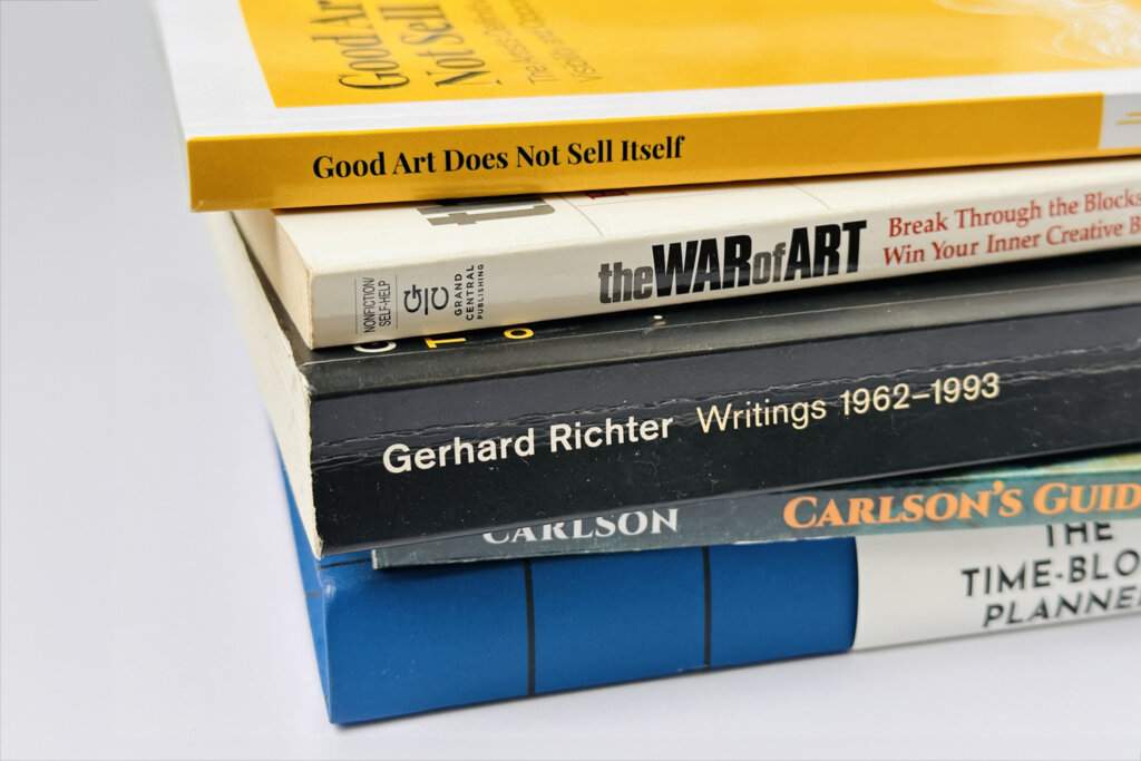
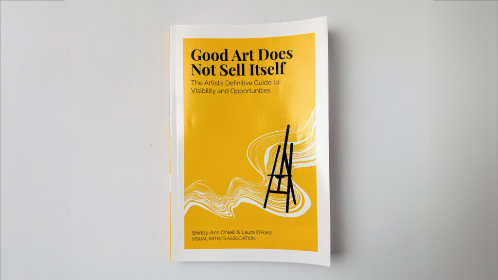
5. Good Art Does Not Sell Itself: The Artist’s Definitive Guide to Visibility and Opportunites by Shirley-Ann O’Neill & Laura O’Hare
“Emma explained how she traced the success of her art career back to taking a mentor’s advice in her early career; to actively seek opportunities to share her work no matter how small. An art prize led to an exhibition, which created more exhibitions, and collectors, art critics and media began to notice here work.“- Good Art Does Not Sell Itself – In relation to the work of sculptor Emma Rodgers
This was my most highlighted book of 2023.
It takes courage to show your art and make the decision to come out from your studio into the realm of criticism. This is an amazing book to have by your side.
It’s packed with practical strategies for marketing, building a brand, and finding the right opportunities to showcase your work.
It’s split into 4 sections and each page is like a mini-blog post that you can take advice from.
Mindset & Habits
Getting Artwork Ready
Opportunities to get visible
Implementation: artist visibility path
The different sections are good for different stages of your work. Some of the ideas on increasing the visibility of your works can help you to stay focused on the long game of creating.
One painting hung in a cafe or posted online can lead to a group show, which can lead to a solo exhibition. Every step is a stepping stone that’s hard to see at the start but builds over time.
Notes on the Quotes: Good Art Does Not Sell Itself
This book is relatable, informative and incredibly useful.
Their insights and recommendations are not only easy to understand but also applicable to real-life situations you find yourself in as an artist. You’ll find yourself nodding along and saying, I can do this! Highly recommended!
I really hope you find one of the ideas or books of interest, because even as a relentless pursuer of new shiny interests and ideas, some of the practices have really stayed with me and helped.
But as with everything, it’s unrealistic to say I’m a changed man, so at this moment, I’m sitting comfortably on the sofa nursing a hot brew, saying it’s ok to go down the odd rabbit hole and fully committing to a few creative ponderings.
I love the couple of days after Christmas. It’s like having surprise days off.
No pressure for Christmas Dinner, no expectations on what you could, should or must do. It’s like a deep chill. It can be a nice time to reflect on what’s worked on your paintings and what hasn’t over the year.
Go back on your phone camera roll from 2023 and see where you went, what you sketched, or what you painted (Or what you wanted to paint but just didn’t get the time to start)
Also, take the pressure off and enjoy your inspirations no matter how quirky or obsessional they seem.
I’ve been enjoying photographing festive drinks! hic
Then December 28th dawned.
This period can start the stirrings of being a bit lost at sea. I call this the ‘nearly new year blues’
You start to put expectations on yourself for the year ahead.
What massive artistic brilliance are you going to have to ‘show’ this year? will you ever find your unique style? Or just even do the paintings you said you were going to do.
Everyone else seems to be super productive, it’s enough to crack open the Christmas chocolate again!
But having been here before, have faith. Every brushstroke you make, every line you draw and every new idea you jot down will carry your practice through.
Your journey as an artist is not defined by the destinations reached but by the courage to take action.
This year might not have brought you the goals you anticipated, but the worst thing you can do is get stuck in your own head, ruminating about what you could or should have done and, as a result, do nothing.
So, as you prepare for the coming year, embrace the unknown. Every artist’s journey is unique. Keep creating, keep exploring, and most importantly, try and remember this sense of calm and freedom you felt waking up on boxing day, it will serve you well in your paintings in the year ahead.
Now, all I’ve got to do is remember my own advice!
Airtight Resealable Palette | £13 24 compartment palette
This palette is incredible in keeping acrylics workable, I’ve had paints for weeks and they can still be used. There is a handy spatula that slides in the front of the palette and a thumb grip on the back. There are a number of different brands that all create very similar palettes.
Something they want, something they need, something to eat and something to read is always a good starting point when you don’t know what to buy someone.
Below are a few last-minute stocking fillers for the budding artist in your life (or just a way to treat yourself!)
For £100 (there is a £20 cashback offer at the moment), you will get fantastic copies of your images at a super high resolution. Just plug it into your computer and scan. You even get a stand so you can store it vertically if needed. Great for making prints of your sketches, scanning your acrylics and recording your watercolours.
Sometimes, with traditional graphite pencils, the surface can reflect light, so your darkest darks aren’t quite as dark as you may like. Faber Castell’s new range of pencils offers a matt sheen to your drawings, allowing you to go super black!
One book I’ve enjoyed this year is The Creative Act by Record Producer Rick Rubin. He’s got some fascinating insights on how creativity works and how to get into the act of creating. We get to move forward in our art, a bit like a coach telling you the obvious thing, but you still need to hear it.
“We Tend to think of the artist’s work as an output. The real work of an artist is a way of being in the world.” Rick Rubin
For just under £30, I thought this might be too good to be true. But it’s great! Thermal printing, so you never need to buy ink again (just new labels). You download the app on your phone, type in the label and print. You can also import icons and images to the app. Great for labelling paint mixes and shelves. I got a set of cable labels aswell, so handy when digging behind the computer for plugging in the printer.
So nice. I use it in practically all of my urban sketches; it adds shapes and fine lines all within one tip that seems to stay wet and workable even if you haven’t used it for weeks. They now have a grey and a sanguine colour.
These pencils are designed to be used for woodworking and construction sites because the narrow metal shaft allows you to mark holes through woodwork. I find them super comfortable to use and really handy around the studio. They have a sharpener in the rear of the pen and come with refillable leads.
You definitely don’t need this, but there is something therapeutic about having a plane as a pencil sharpener.
For the art appreciator
9. National Art Pass | £56.25 individual year artfund.com
This pass gives you discounts and free entry to hundreds of events and exhibitions across the UK, which is marvellous!
For the digital painter
10. Paperlike screen protector | £34 for 2 Paperlike.com
If you find the surface of your iPad too glossy and slippy to sketch on, this might be the answer. Paperlike is a screen protector that also adds some resistance to the stylus. You lose some of the intensity and contrast of the screen image, but you gain more grab.
Have a creative Christmas, and if you’re running right up to the wire, all the art courses on the blog can be gifted as instant digital Gift Vouchers!
Often, the biggest obstacle to success is overcoming the worry you’re wasting your time learning a new medium that doesn’t ‘fit’ your style, or you don’t have the talent to be an artist or, worse, wasting your money buying loads of art materials that you end up not using!
Getting over the Frustration Barrier
“Many things aren’t fun until you’re good at them. Every skill has what I call a frustration barrier, a period of time in which you’re horribly unskilled and you’re painfully aware of that fact.” Josh Kaufman – The First 20 Hours
Even uttering the phrase “I am an artist” can stir feelings of self-doubt. But take heart – every creative feels this impostor syndrome. What matters is moving forward anyway.
The main thing to grasp is that painting is a teachable skill anyone can develop, regardless of innate talent. Some people prefer to take classes with a live instructor, while others prefer to learn independently.
There is a place in the art world for every single artist, and it’s never too late to begin painting.
The main thing to realise is that painting can be learned; it’s a skill that can be developed.
I hope this guide gives you insight into not just materials and mediums, but also a window into the possibilities.
Skill vs Talent (Talent is Overrated)
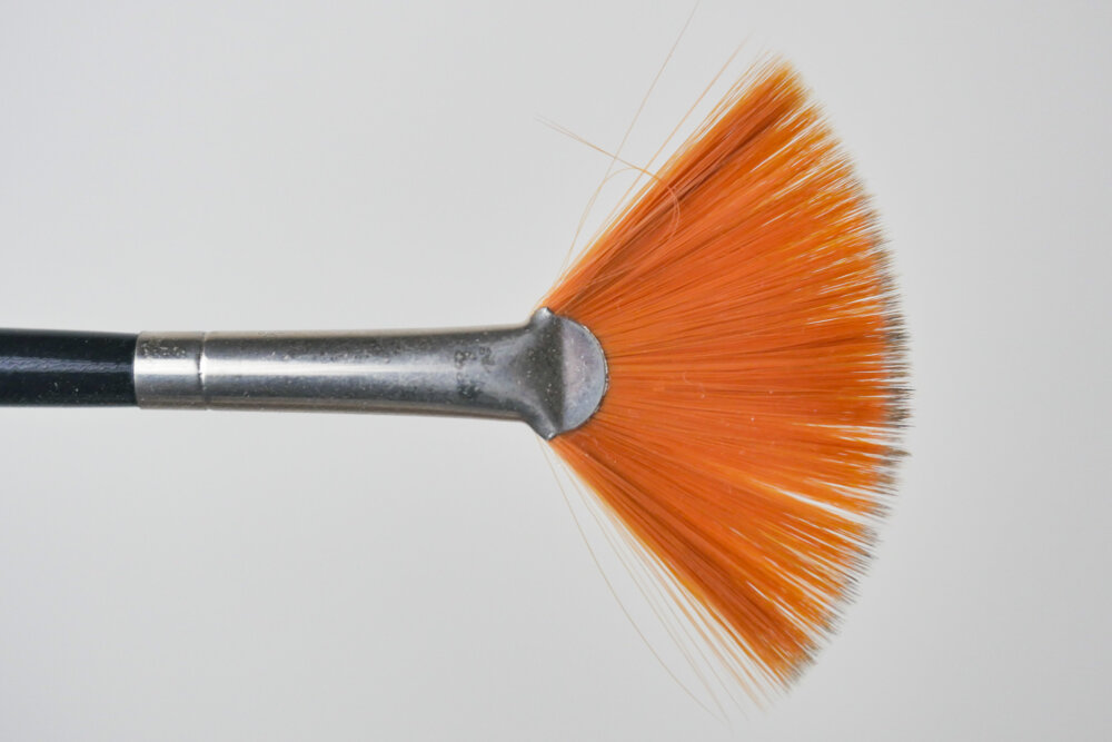
A Fan Brush used for blending
Can I learn art if I have no talent?
Sure you can.
Can you learn how to bake a cake if you have no talent?
100%.
It’s the same approach. It’s not about natural talent but learning a new skill.
Beginning painting is learning to embrace experiments and find inspiration in your mistakes.
‘Happy Accidents’ can be the beginnings of creative breakthroughs, so be open to when your painting ‘goes wrong’ and try to see what new lessons can be learnt.
Talent is overrated and can be an excuse you can rely on rather than putting in the time on the foundations. The path to success in learning any new skill is focusing more on improving the fundamentals.
“Skill is the ability to do something. Talent is the rate at which you can acquire the ability to do something.¹ If you have a talent for the guitar, that means you will learn to play the guitar faster than someone who doesn’t have a talent for the guitar. If you don’t have a talent for the guitar, that means it will take longer to learn to play the guitar than it would if you did have some talent. For most things* in life, talent doesn’t really matter. The rate at which you can acquire the ability to do something doesn’t really matter. What really matters is the length of time you can do something.” – Billy Oppenheimer
This quote is so true, “what really matters is the length of time you can do something“.
If you set yourself a goal of creating one painting, you will face problems.
If it goes well, you’ll be worried that the next one won’t be as good, so you’ll procrastinate on continuing.
If it goes badly, you’ll convince yourself you have zero talent; painting isn’t for you, and all those teachers were right.
So what’s the answer?
Start an experiment.
Let’s say you’ll try to paint 100 paintings before you decide if it’s for you.
Does 100 sound too many? It’s estimated that Picasso created 13,500 paintings and around 100,000 prints and engravings.
And don’t get put off if you’re coming to painting later in life. Your unique experiences and perspectives can inform your practice and tell your journey. (Range: Why Generalists Triumph in A Specialized World By David Epstein is a great book on this)
I teach classical painting methods in oils and acrylics that focus on fundamental painting principles.
My philosophy is less is more. A distilled approach to classical painting. A solid foundation for anything you choose to paint, regardless of subject or medium.
I help other aspiring artists not make the same mistakes I did, so if you’ve ever dreamt of picking up a paintbrush and filling a canvas with colour but don’t know where to start, let’s go on a creative journey together to discover how to ‘see’ like an artist.
Students often ask me, ‘What essential materials do I need to begin painting?’
Winsor & Newton Cotman Travel Watercolour Kit
When you are learning anything new, you want to get the best results without investing too much too soon, so before we get into materials, I found it usually helps to begin with the end in mind.
You need to decide on your medium, and each medium has its own charm.
What are you trying to emulate, or what artists are you trying to recreate?
Make a note of paintings you like the style of, what they were painted with and the effect or technique you want to achieve.
You might have tried watercolours and got buckled paper or put off using oils due to the dangers and smell of turpentine (but not realise how far modern oil materials have come.)
You might be much happier with pencils and sketchbooks than painting on canvas.
You’ll get faster results if you can match the correct medium to your personality, aspirations and experience, but knowing which medium will suit you best is impossible until you try.
When you’re dealing with any paints, there are a few things to consider:
Handling properties
Drying times
Surface that you want to work on to
Implement you want to use to apply the paints
Environment or the space you’ve got available to you
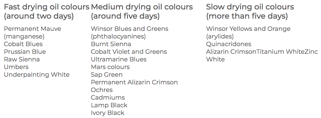
Oil Paint
Oil paints can be amazing to work with, from quick Alla-prima oil canvas sketches to photo-realistic oil portraits.
They have a lovely buttery consistency and a slow drying time, enabling you to make changes over a longer period, adjust shapes, or work wet-into-wet with thick impasto marks.
Oil paints stay workable for much longer than acrylics; the paint on the palette stays pliable.
And oils are king when it comes to blending colours.
Because of their slow-drying nature, you can enjoy the luxury of tweaking and softening your work, creating wonderful, subtle paintings. This is especially true for portrait painting when the shading of the face can need constant revisiting.
If you’re a bit wary because of all the solvents associated with traditional oil painting, you could use water-mixable oils (WMO’s) that you can dilute with water. (Watermixable Oils vs Traditional Oils)
Pro Tip: Even though you can use water with water-mixable oils, you still need to introduce a water-mixable thinner and water-mixable oil to get the best result. This will give you better paint flow and handling. Try to think of them as ‘water-cleanable’ oils.
Bear in mind that oil paint is a bit messy. I find it gets everywhere just because, well… it tends to get everywhere!
If you’ve got a house full of cats or small children running around, oil painting can make a mess; that goes for water-mixable oils, too.
With Oil Paint you can change your medium to alter paint handling qualities
Preparation is key. Due to the oil in oil paints (usually linseed oil), it’s best to work on a prepared canvas or board.
If you have plenty of time set aside for your painting, traditional oils can be fantastic, but if you want to work with thick paint, you need to consider drying times.
Each particular pigment needs a different amount of oil mixed with it, resulting in different drying times. e.g. Earth colours such as Burnt Umber are rapid drying, whereas Ivory Black takes much longer to dry.
Ensure a well-ventilated space; traditional turpentine and white spirits can be quite strong. I work with odourless mineral spirits or ‘Zest It‘ (a thinner made from citrus ) with very little odour compared to turpentine.
Many new solvent-free products, such as Gamblin’s Solvent-free Gel, are now coming to market, so there are plenty of alternatives. These offer a way of diluting the oil paint without using traditional solvents; you can also clean your brushes with walnut oil (Murphy’s soap in the US gets good reviews).
Acrylic Paint
Professional Artist Acrylics have a higher pigment load than student-grade paints
One of the key things that make acrylics a great medium to start with is you can paint on anything: paper, card, canvas board, whatever you have to hand.
Set up is quick; they are water-soluble, fast-drying and water-resistant when dry. They clean up with water, and there’s no smell!
They can be used in thin layers like watercolours or in thicker, more opaque applications like oil paint.
You can mix clean, bright colours, and the crisp edges that can be achieved with acrylics can be perfect if you want to paint with a more graphic composition. You can quickly mask out areas, work over them, and easily cover a hard shape with thicker paint.
Blending with acrylics can be a bit frustrating due to the speed of the drying time; acrylics dry by evaporation and tend to dry quite quickly.
Artists refer to this as having a short ‘working time’; however, this can vary depending on several different factors; the main ones are:
How thick or thin is your application of the paint
The absorbency of the surface you’re working on
The size of the painting
What you dilute the paint with, either water or a specialist medium
The heat and humidity of the environment you’re painting in
If you are working on a large scale, it can be practically impossible to work the canvas as a whole to bring together the same finish. But apart from working quicker or on a small scale, you can add a medium to the paint to help keep the working time open for longer. Soft gel gloss, a retarder (slows down drying time) or my preferred choice, glazing liquid gloss, make achieving smooth blends with acrylics easier.
Beautiful graded washes, translucent colours, seamless transitions, a quick drying time, and super reasonably priced to get started. You can buy a Cotman travel kit, a pad of watercolour paper, a couple of brushes and get going!
If you want to paint outdoors, watercolours are a great option because your kit is pretty compact. Quick, impromptu watercolour sketches of a little plant next to you or a study of your garden always look pretty good in my experience.
Watercolour is all about washes and contrasts over line work, so you must know your drawing skills.
You can, of course, paint abstractly to produce swirls, blocks and washes, but if you’re trying to create a scene, a landscape or a realistic still life, there will usually be a fair amount of a drawing element to it.
When you paint with acrylics or oils, although the initial sketch and drawing out are still important, you can build up the painting through the form using an opaque application, whereas, with watercolour, you’re traditionally washing over a line. (Here’s an Ink and Watercolour demo)
So, what are the essential beginning painting materials I would need?
The Winsor & Newton Artists’ Choice Professional Watercolour Set of 18 half-pan colours would be a great start for new watercolourists. Great pigmentation and these little pans last a really long time.
You could get away with one good brush, but ideally three brushes, and you could probably do 80% of the paintings with these three brushes.
a small round
a medium round
a bigger mop brush
For watercolours or gouache, brushes are usually soft, have a spring and can hold water. Most traditional brushes are made from animal hair, and the quality of the brush’s bounce and feel depends on the quality of the hair used. But you can get really good quality synthetic brushes now, too. You can read aboutA Quick Way to Understand Brushes here.
Flat & Round Synthetic Acrylic Brushes (Isabey Isacryl, Rosemary & Co Golden Synthetic, Princeton Aspen)
I think a great starter set for acrylic painters would be the Winsor & Newton Professional Acrylic Colour Set of 12 20ml tubes.
Again, a handful of brushes would be a great start.
a small round for detail
a flat brush
a Filbert brush,
and a bigger brush 1 1/2 inches for laying down the tonal ground
And Glazing Liquid Gloss as your medium.
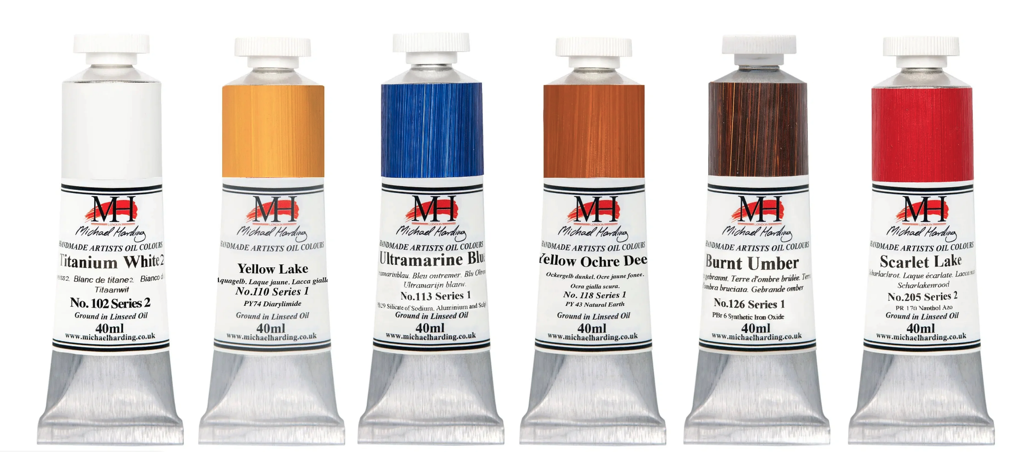
Michael Harding Introductory Oil Painting Set
And for oil painters, I’d start with the Michael Harding Introductory Kit. The set consists of six tubes of 40ml paint: Titanium White, Yellow Lake, Ultramarine Blue, Yellow Ochre Deep, Burnt Umber and Scarlet Lake.
When it comes to the brushes, it is definitely easier to have more and, ideally, be able to hold a few brushes in your hand at the same time.
For example, if you’ve got a white brush and want to go from white to black with oils, it is really tricky.
It takes loads of washing, impeccable cleaning or a huge load of paint to transfer or change oils from light to dark. It’s very easy to end up with muddy colours on your canvas and messy everything else, so ultra-clean practice of brush handling is key here.
You’ve got to spend more time colour mixing, then make a mark and leave it to keep a clean colour, gently blending out the edges.
The other difference with oils is you need less paint, so you only need to put out a tiny bit of pigment. It will last ages, and a small paint volume will have good coverage.
When it comes to the mediums, you can use an odourless mineral spirit, like Gamsol, to cut through the paint to thin it. An oil medium to add flow and oil. Or one of the many non-toxic mediums as an alternative to using a thinner.
How do I set up a basic painting workspace at home?
Firstly, consider light and ventilation.
Essentially, the easiest thing is to have a table and a slightly angled board or a tabletop easel because then you can sit behind and paint in the right light.
You can sit next to a window, but it will vary depending on what time of day it is or how dark it is.
An LED bulb or an LED panel behind and above you is the best thing to get. Clipped on, looking down onto the easel.
This, again, will depend on if you’re using oils, which are a bit trickier because they often get a glare onto your canvas. So you have to make sure you’ve got the hang just right, or you can adjust the angle.
Have a kitchen roll or rags for cleaning up and a bin, and make sure you have a metal bin for oils because of the fumes and good practice with the rags disposal.
What are some of the fundamental basic techniques I should focus on as a beginner painter?
It sounds boring, but working with black and white to work on your tones, value, and contrast is fundamental. Paying attention to the value (lightness and darkness) of colours and learning to create contrast in your paintings is essential for depth and visual interest.
And then, after that, I would work on colour mixing because if you’ve got your tones and colour mixing right, everything else falls into place.
And also not to forget, drawing.
I always say most painting mistakes come from your drawing mistakes.
You need more brush techniques with watercolour. With this medium, mastering brush control is key for achieving textures and effects, such as variated wash, wet into wet, lifting and blooms.
You’ll be thankful for that larger brush that holds more water!
When you’re working in acrylics, my top tip would be use more paint than you think you would need.
And with oils, make sure that you don’t drag or you don’t reapply; it’s so easy to make colours dirty. Ideally, you’d lay a colour down, leave it, and then work over it to blend the edges.
How do I choose a subject to paint?
Begin with simple subjects and compositions, and you can tackle more complex scenes or ideas as you gain confidence.
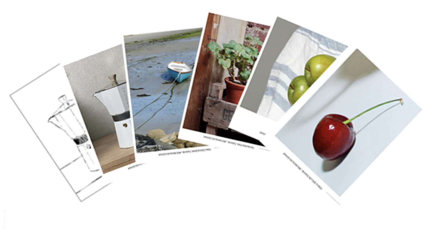
If you are looking for simple projects, I’d recommend signing up for the email newsletter, if you haven’t already. There are 10 references to work from; just pick one of them and follow it.
I often find beginners want to put their own mark onto a canvas; even when they’re first beginning, they don’t want to copy something. But if you look at any of the Students Success Pages, everyone following the same image with the same colours has their own character and natural style. It’s almost like having your own handwriting but with painting!
So, when you are learning, I recommend copying the basics until you understand the language of paint.
Which of your courses would you recommend?
The Beginners Acrylic Painting Course gives a good overview of different paints, such as high-flow acrylics, heavy-body acrylics and different mediums.
There are three different projects: a still life, a seascape and a landscape.
Alternatively, if you did one of the Morning Painting sessions, like the Modern Still Life, you would just have one subject, five colours, and three brushes.
It’s super simple to get started. There’s a drawing guide that you can follow along and you get to a finished painting quicker because it’s more focused.
Remember, painting should be enjoyable!
Let your creativity flow, and don’t be overly critical of your work; it’s all part of developing your ‘talent.’
Welcome to my NEW Acrylic Painting Course, Coastal Canvas!
This impressionistic seascape is all about simplicity.
It has been designed with short 10 -20 minute ‘micro-learning’ lessons, so you’ll build your knowledge, even if you’ve never painted seascapes. The project is so simple that you’ll have a finished painting in a few short sessions.
In this course, we view the coastal path across gentle waters, where sailboats are harboured up or just coming into the dock.
Set in the early evening golden hour light, the foreground has a secluded coastal garden with pink hydrangeas in full bloom; the greens are dark, cool and olive in tone and frame the passage of the sea.
Then, in the far distance, you’ve got a warm headland of pastel yellows and greens glowing from the golden light, creating a contrast of values and tones of greens from the foreground to the background, and then just a glimpse of a white lighthouse in the far distance.
Loosen Up Your Acrylic Painting
Many beginners think that painting the sea is too hard or that getting a convincing perspective is beyond them and that they need special drawing skills. But in reality, all you need are simple shapes, scale and a framing shift when mixing your colours.
This course is designed for beginners, with a simple subject (even if you’re brand new to drawing) and a limited palette of colours.
Learn how you can keep your brushstrokes simple and the subject fresh to create an impression of a scene rather than a photorealistic rendering. (You could also follow along with Watermixable Oils or Traditional Oils.)
I’ll walk you through how to mix colours, analyse pigments and distil your subject into a compelling painting. We’ll cover the preparation of your surface & drawing out, observing the composition with sketching and scale, and keeping the boats in scale to give that sense that they’re in the distance.
Inky Depths to create realism.
Change the intensity of the greens by changing the pigments, lose the fear, and embrace black in landscapes and seascapes. You’ll discover you don’t need to go bright with your greens in order to make them feel realistic. In fact, less is more; the more darker and muted your greens are, the more realistic they will read in a landscape painting.
When capturing coastal light, sea and sky, understanding the undertone and colour bias of the different blues to achieve the glimmering reflected lights.
When it comes to the details of flora and focal points, we keep things gestural and impressionistic, looking for passion, not perfection.
By the end of this course, you’ll have that insight into the hidden under-workings of a painting, teaching you classical painting skills alongside impressionistic brushstrokes.
Gained confidence that you could create a painting from a simple subject, motivating you to tackle different, more challenging views from your own photo library.
Capture the Essence, Not Every Detail.
Learn how to paint realistic headland by controlling your colour intensity
How to create a ‘vignette’ with your foliage to frame your view
How to paint the sea by using colour strings
How to control water flow and absorption
How to select an image that will translate well to paint
How to check if a subject will make a compelling painting subject (by creating a postcard prep study)
There are some intermediate lessons where we expand the colour palette, but each step is described clearly and succinctly.
What’s in the Course?
1hr 45min Self-Paced Downloadable Video Course
1 x Seascape Painting subject from start to finish, working from a reference image.
8-step-by-step video lessons (split into ‘micro-learning’ sections.)
DRAWING TEMPLATE – line drawing to follow to help you overcome the blank canvas
TOOLS & MATERIALS: Downloadable Materials List PDF
REFERENCE IMAGES: Downloadable Line drawings.
Study at your own pace ✔
Over 1hr 45min+ hours of detailed video instruction ✔
Full Lifetime Access to the Lessons ✔
One-time Payment ✔
Who this course is for?
A beginner to acrylics who wants to gain confidence in their painting by following a step-by-step proven plan. An aspiring artist who loves the sea and the coast and has folders of photos they would love to capture in paint but are unsure of the best approach.
The act of creating a portrait is an emotional one.
It goes far beyond capturing a mere likeness; it delves deep, exposing their character and yours.
A finished portrait may exude confidence and calm, but the journey of its creation is often a complex maze of doubts, fears, and self-criticism for the artist.
We can overthink the composition or the medium choice. Then we question, maybe we should have studied drawing a little longer. Maybe we should start when we’ve got more time?
These are often (well-constructed) excuses based on two main insecurities.
The fear we won’t do the subject justice
The fear of social ridicule
I’ve just started a portrait of my nephew, and before I began the process, those same butterfly feelings bubbled up.
The first fear is dealt with more logically now, compared to when I was first starting out.
I still question, ‘What painting method will I use?” “Will it look like him?” “Will I overwork it?
But it’s the second fear that seems to hit me the most and as hard.
Will someone else judge your portrait attempts and deem you a ‘bad’ artist?
Probably.
But I’ve learnt this can happen if you’re a professional artist with years of painting experience behind you as easily as if you’re an absolute beginner.
On your first driving lesson, if someone judged you as being a ‘bad driver’, you would have laughed at them and said, ‘I know! It’s the first time I’ve ever tried.’
No blame, no shame. That’s the essence of successfully progressing as a portrait painter.
The Challenges
If you’ve overcome the fear of actually starting, painting a portrait comes with different challenges to other subjects.
First, there is the technical challenge of creating a three-dimensional form on a two-dimensional surface.
Then, the colour mixing challenge of expressing realistic skin tones, hair and features.
And finally, the realism challenge of creating a likeness to the sitter.
So, how can I help?
Here are three solutions that I’ve found can really help overcome insecurities when painting portraits:
1. Build Confidence Through Practice:
One of the most effective ways to combat insecurities is through consistent practice.
Many of my paintings are just for personal use and not intended for public viewing. The more I practice, the more my skills will improve, leading to increased confidence in my abilities.
2. Focus on the Process, Not Just the Outcome:
Insecurities often stem from fixating on the end result.
Focus towards enjoying the creative process itself. Self-expression, exploration, and experimentation. When the process becomes the primary goal, you can find fulfilment in your work regardless of external judgments.
3. Seek progress, not perfection: Imperfections are a natural part of the creative journey, and learning any new skill will be a series of jumps in progress and self-reflection on how much there still is to learn.
When following a course, the aim is just to follow the steps.
The focus of this course is simple, natural colour mixes to help you create realistic skin tones.
The concern for many beginners is that portraiture feels too challenging and would be above their current skill level. So I’ve designed these portrait courses to be as user (and fear) friendly as possible.
We learn about lighting, colour theory and create colour swatches before even starting the portraits. There are line drawings to work from, and we start slow with just a four-colour painting palette.
If you stick to the lessons and follow the steps, you’ll gain huge confidence in what is achievable.
Creating Realistic Skin Tones, learn the secrets behind mixing and applying skin tones that appear natural and lifelike.
Gain insights into the nuances of capturing subtle transitions in the skin, from shadows to highlights.
Material recommendations.
How to master the Zorn Palette, the amazing power of a limited palette.
Colour theory, colour strings, and palette choice.
Lighting theory to create accurate colour mixes for your portraits.
Paint application & brushwork, from scumbling to palette knife.
Poster study using a more direct Alla Prima style.
Includes over 4 1/2 hours of video instruction, three self-study painting assignments, materials guide PDF, and downloadable reference images to paint from.
2. Oil glazing portrait course (suitable for intermediate or have some drawing experience with portraits)
This course is a more advanced portrait course teaching a classical painting approach based on multiple layers of painting (called in-direct painting)
It needs patience and more time commitment.
It’s a method that seems counterintuitive. Paint your portrait first in black and white and then apply colour on top.
The art of combining the classical technique of grisaille (black and white) with the mesmerizing effects of colour glazing creates stunningly lifelike and captivating portraits.
Mastering Grisaille Technique: Learn the foundation of grisaille painting, using monochromatic tones to create a strong value structure and achieve realistic shading.
Creating your own painting medium (traditional and modern materials)
Completing a value study painting using the planes of the face.
Discover the art of colour glazing, layering translucent colours over your grisaille underpainting to achieve luminosity and rich tonal variations.
Explore the magic of transparent and semi-transparent glazes to enhance the vibrancy & learn about glazing mediums.
Completing two head portrait paintings.
Includes over 6 hours of video instruction, two self-study paintings, materials guide PDF, and downloadable reference images to paint from.
P.S. – If you have done either of the portrait courses and have any encouraging words or testimonials for other artists who might be at the point where you were before starting the course, drop me a comment below!
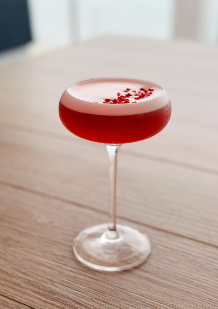
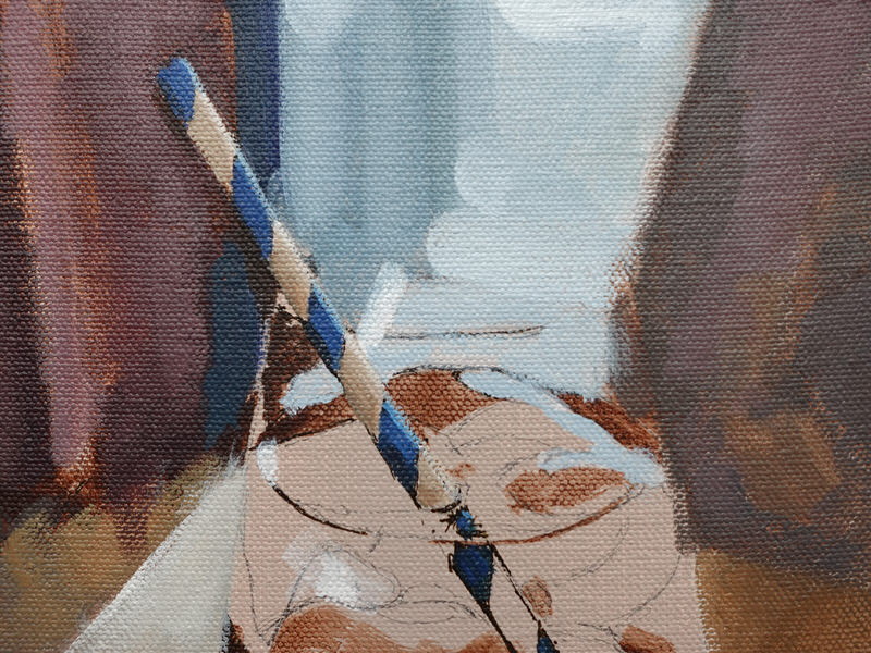
This week, I’ve been working on a Spritz cocktail painting inspired by one I enjoyed in St Mawes.
This subject offers an excellent opportunity to practice capturing reflections in water and exploring how coloured liquids can challenge our visual perception.
While painting the background and the surface around the glass might be relatively straightforward, the real challenge arises when we start painting the cocktail itself. Your mind will naturally begin to second-guess what you’re seeing. Thoughts like, “That’s too dark for a lemon,” or “The straw should be white, not grey,” might pop up.
You’ll be craving a cocktail yourself after tackling all these tricky reflections!
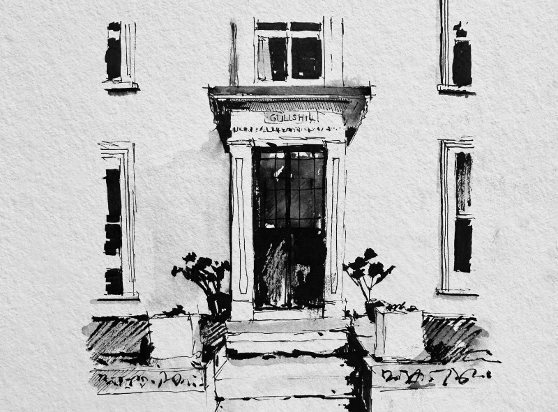
Exploring the narrow cobbled streets of St Mawes, every turn uncovers a charming cottage or an absolutely stunning view. This small historic fishing village is nestled at the end of the Roseland peninsula on the south coast of Cornwall and is magical.
Natural stone, slate, and white lime-washed simplicity, so with pen in hand, I set about capturing some of St. Mawes architectural coastal doorways.
Get your pencil case ready and sharpen your brushes, as I’ve been busy in the studio adding the finishing touches to a NEW Acrylic Still Life Painting Course.
In Sunlight & Shadows, we focus on a couple of sunlit terracotta plant pots against a lovely pink wall. Vibrant hues and the mesmerising play of colourful shadows can add so much more variety and intrigue to a composition; imagine capturing the essence of these elements and bringing them to life on your canvas.
Shadows can totally transform a scene. We sometimes think of them as dark, but they don’t have to be dull.
I’ve developed this painting course to teach you the skills and techniques to create a stunning painting. We’ll cover the preparation of your surface, drawing out, exploring colour groupings and blocking-in.
Discover the secrets of a split primary palette, enabling you to achieve the widest range of hues and expand your colour knowledge.
Create an illusion of reality, turning a form following the light fall and experiment with slow-drying acrylic mediums to manipulate and blend colours with ease, enhancing the realism of your painting.
You’ll learn about underpainting, using warm and cool colours to evoke a sense of natural light. When painting the greenery, we mix colour strings and observe value and colour shifts, most importantly, looking at the concept of how the shadows are key, actually as important as our main subject.
Working through this acrylic still-life course, you’ll learn to capture depth, richness, and texture while learning classical painting techniques.
And in the bonus Lesson, The Palette Knife Edition, we start to simplify it even more, learning how to expertly wield a palette knife, adding texture, expression and freedom to your artwork!
The shifting nature of our perception can be a huge obstacle when learning how to paint.
Have you ever seen your artwork as a masterpiece one moment, only to label it a disaster the next? I know I have!
The first step to advancing your critical judgment skills is to realise that there probably won’t be a moment you see your work with 100% clarity.
We can all be swayed by various cognitive biases of creation.
A cognitive bias is a tendency to make decisions or take action directed by emotions rather than by careful thought. They can subtly skew our judgment and we can become influenced by our own personal preferences, beliefs, or feelings caused by our values and experiences. When viewing our paintings we tend to place excessive value on pieces we have crafted ourselves or have sentimental attachments to certain scenes or memories.
Or you may just been standing at the easel all afternoon, trying to mix the exact colour for too long and you can’t see it anymore!
The importance of self-checking your own work as an artist.
Do you find it easier to notice flaws in other people’s artwork compared to your own?
When you’re so concentrated on your own painting, it can be challenging to assess your work and identify areas that need improvement. This is because you are seeing others’ work from a fresh perspective every time. You’ve no idea of the time it took them to paint it, the struggles they faced with the materials or the entire backstory behind the image. You just have a single image to look at. That’s why having an art tutor or going to a class with live feedback can be so helpful.
So if the success of our paintings is based on the way we can critically view them, what can we do to be more objective?
I’ve put together a list of 7 small but helpful tools and techniques that I use in my painting practice to help me and hopefully, they will help you too.
Back in the summer of 2021, I read the Rijksmuseum, Amsterdam, were planning the biggest-ever single collection of Vermeer’s paintings for a Spring 2023 retrospective.
Johannes Vermeer (1632 -1675) is one of the great 17th-century Dutch masters, best known for his tranquil, contemplative scenes depicting everyday life.
February saw the opening of the exhibition, and last week we were lucky enough to experience the show!
What I love about Vermeer’s paintings is how he captures the sense of light fall; it feels like there’s a natural volume. He uses different paint handling to express a different quality.
From subtle gradations in the shadows as light streams through a window and drops away. To sunlight falling onto an object so convincingly, if you put your hand in the painting, it would be warm.
Not only did he capture the light, he told a story.
This week I’m lucky enough to be in Amsterdam to experience the largest ever Vermeer Exhibition!
28 of Johannes Vermeer’s known 37 works, have been brought together from museums and private collections across the world for this unique opportunity at the Rijksmuseum.
It’s currently a sell out show with over 450,000 tickets sold! but they are releasing new tickets so it’s worth checking the site. (Rijksmuseum Vermeer Tickets)
On display is one of my favourites, ‘The Little Street’ and we do a master copy of the painting in the Beginners Water Mixable Oil Course.
When I get back to the studio I’ll put together a exhibition review but for now I’m off to grab a coffee and a Stroopwafel.
The 5hr+ course is best suited if you’ve been working with acrylics and want to learn about the pros and cons of water-mixable oils. We go through lots of materials and options to give you an overview of what’s available with water-mixable oils.